whatisthis?
Project. 반응형 페이지 - (1) 환경 setting 본문
(1) 환경 setting
- 터미널 명령어
touch index.html style.css	// 파일 생성
mkdir assets	// 디렉터리 생성
- font 가져오기 (import)
<link rel="preconnect" href="https://fonts.googleapis.com" />
<link rel="preconnect" href="https://fonts.gstatic.com" crossorigin />
<link
  href="https://fonts.googleapis.com/css2?family=DM+Sans:wght@400;700&display=swap"
  rel="stylesheet"
/>
- 기본 css 적용 (box-sizing이나 font-family 등)
* {
  box-sizing: border-box;
  margin: 0;
}

body {
  font-family: "DM Sans", sans-serif;
}
- 부트스트랩의 grid 시스템 가져오기
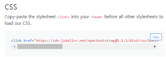
지난번처럼 아래 코드를 붙여넣어도 됨.
하지만 우리는 grid만 쓸거니까 아래 css 파일을 쓰자!
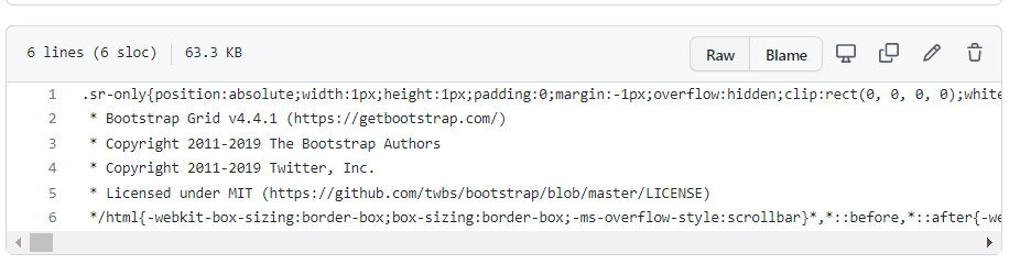
전체 css를 복사해서
새 파일 생성한 후 붙여넣음.
grid.min.css
.sr-only{position:absolute;width:1px;height:1px;padding:0;margin:-1px;overflow:hidden;clip:rect(0, 0, 0, 0);white-space:nowrap;border:0}.sr-only-focusable:active,.sr-only-focusable:focus{position:static;width:auto;height:auto;overflow:visible;clip:auto;white-space:normal}/*!
 * Bootstrap Grid v4.4.1 (https://getbootstrap.com/)
 * Copyright 2011-2019 The Bootstrap Authors
 * Copyright 2011-2019 Twitter, Inc.
 * Licensed under MIT (https://github.com/twbs/bootstrap/blob/master/LICENSE)
 // 이하 생략
그리고 나서 index.html에 링크해줌.
<link rel="stylesheet" href="grid.min.css" />
- grid 커스텀 설정 (max-width)
단, 기본 설정에서는 xl(1200px이상)을 따지지만,
우리는 최대 너비를 960px로 하기로 결정했으므로
grid system을 우리가 커스텀 해줘야한다.
>> grid.min.css 말고 style.css를 수정하자.
container의 max-width: 960px로 해준다.
(덮어쓰는 것이므로 !important 해줌)
style.css
/* Custom Grid System - Fix container Width */

@media screen and (min-width: 1200px) {
  .container {
    max-width: 960px !important;
  }
}
- reset CSS
a, button, input, textarea, li 등
1/ anchor
a {
    text-decoration: none;
    color: inherit;
}
inherit은 상속받은 값대로 설정하라는 뜻.
예를 들면, body>a라면, body의 color을 따라야함.
2/ form 관련 요소 - font family가 안먹음.
한번 더 설정해줘야함.
button,
input,
textarea {
  font-family: "DM Sans", sans-serif;
  font-size: 16px;
}
3/ form 관련 요소 - 클릭시(active) & 포커스시(focus) 파란색 그림자 생김
button:focus,
button:active,
input:focus,
input:active,
textarea:focus,
textarea:active {
  outline: none;
  box-shadow: none;
}
4/ 리스트 스타일 제거
ul,
ol,
li {
  list-style-type: none;
  padding-left: 0;
  margin-left: 0;
}
5/ 본문(p태그)의 typography 설정
p {
  font-size: 16px;
  line-height: 1.5;
  color: #2b292d;
  letter-spacing: 0.01em;
}
6/ 위 사항은 모바일 화면에서의 typography이고, pc화면에서는
미디어쿼리를 이용해서 font-size와 line-height가 변경되게.
(❗ 항상 모바일 먼저 하자! 즉, 작은거부터 먼저 하자)
/* >= 768px (Desktop) */

@media screen and (min-width: 768px) {
  p {
    font-size: 22px;
    line-height: 1.36363636;
  }
}
🔻Design File
Figma
Created with Figma
www.figma.com
🔻Reference Lecture
김버그의 HTML&CSS는 재밌다 - 구름EDU
HTML&CSS를 한번에! 탄탄한 개념이해부터 실습까지 한 강의로 끝내기, 실무 가능한 실력으로 😎
edu.goorm.io
'PROJECT > WEB' 카테고리의 다른 글
| Project. 반응형 페이지 - (3) Service Section (0) | 2022.03.02 |
|---|---|
| Project. 반응형 페이지 - (2) landing page (0) | 2022.03.02 |
| LX Z:IN Interior Sheets Project 디자인 draft (2/24기준) (0) | 2022.02.24 |
| [project] Rainy-player - 진행사항 기록 (0) | 2022.02.22 |
| React JS - Movie App project (part 4-2) (0) | 2022.02.22 |


