whatisthis?
html_pr10) style.css Code Review 본문
https://mywebproject.tistory.com/116
@import url("https://fonts.googleapis.com/css?family=Nunito+Sans:400,600&display=swap");

* {
  margin: 0;
  box-sizing: border-box;
}

html {
  font-family: "Nunito Sans", sans-serif;
  font-size: 16px;
  line-height: 1.5;
  color: #1f2d3d;
}

body {
  display: flex;
  flex-direction: column;
  justify-content: center;
  align-items: center;
  width: 100%;
  height: 100vh;
  margin: 0 auto;
  background-color: #f8f9fa;
}

body::after {
  content: "kimbug©";
  display: block;
  margin-top: 50px;
  color: #1f2d3d;
  font-size: 12px;
  font-weight: 600;
}

.subscription {
  display: flex;
  flex-direction: column;
  justify-content: center;
  align-items: center;
  align-items: center;
  padding: 32px 56px;
  border-radius: 6px;
  text-align: center;
  background-color: #fff;
  box-shadow: 0 3px 30px 0 rgba(0, 0, 0, 0.025);
}

.subscription h1 {
  margin-bottom: 8px;
  font-size: 24px;
  line-height: 1.6666666667;
  font-weight: 600;
  color: #212529;
}

.subscription p {
  color: #333e47;
}

.input-group {
  display: flex;
  justify-content: center;
  align-items: center;
  margin-top: 20px;
}

.input-group input {
  width: 240px;
  height: 36px;
  padding: 0 12px;
  border: none;
  border-radius: 4px;
  margin-right: 4px;
  font-size: 14px;
  font-family: "Nunito Sans", sans-serif;
  background-color: #f6f8fa;
  color: #333e47;
}

.input-group input:focus,
.input-group button:focus {
  box-shadow: none;
  outline: none;
}

.input-group input::placeholder {
  color: #b6bec8;
}

.input-group button {
  height: 36px;
  padding: 0 12px;
  border: none;
  border-radius: 4px;
  font-size: 14px;
  font-family: "Nunito Sans", sans-serif;
  font-weight: 600;
  color: #fff;
  background-color: #ff4438;
}
Analysis
* {
  margin: 0;
  box-sizing: border-box;
}

html {
  font-family: "Nunito Sans", sans-serif;
  font-size: 16px;
  line-height: 1.5;
  color: #1f2d3d;
}
전체 기본 설정.
box-sizing
box-sizing은 요소의 너비와 높이를 계산하는 방법을 지정함. -> 보통은 border-box가 좋음
| content-box | 기본 CSS 박스 크기 결정법을 사용합니다. 요소의 너비를 100 픽셀로 설정하면 콘텐츠 영역이 100 픽셀 너비를 가지고, 테두리와 안쪽 여백은 이에 더해집니다. |
| border-box | 테두리와 안쪽 여백의 크기도 요소의 크기로 고려합니다. 너비를 100 픽셀로 설정하고 테두리와 안쪽 여백을 추가하면, 콘텐츠 영역이 줄어들어 총 너비 100 픽셀을 유지합니다. 대부분의 경우 이 편이 크기를 조절할 때 쉽습니다. |
+)
| html 선택자 | 태그(요소) 선택자. html 요소에만 스타일 적용. |
| * 선택자 (= asterisk) |
공통선택자. 모든 태그에 스타일 적용 - head, style, body, title, html 등 모두 다 선택. 공통선택자는 모든 요소 및 그 하위 요소를 선택하여 스타일 지정함. -> 클래스 / 아이디와 상관없이 모~든 요소. |
___
body {
  display: flex;
  flex-direction: column;
  justify-content: center;
  align-items: center;
  width: 100%;
  height: 100vh;
  margin: 0 auto;
  background-color: #f8f9fa;
}
body 전체를 flex의 컨테이너로 지정하고,
flex-direction지정해줌.
flex에 관련된 내용은 아래에 포스팅하였다.
https://mywebproject.tistory.com/69
CSS3 - flex (positioning)
https://beautifulcss.com/archives/2812 Beautiful CSS » 포지셔닝 : Flexbox 이 게시물은 2020년 10월 25일 수정판입니다. Image from Introducing Flexbox Fridays 이야기에 앞서 Flexbox Layout은, 새롭게 CS..
mywebproject.tistory.com
-Flexbox로 레이아웃을 잡으면 모바일을 포함한 하이브리드 앱으로 만들때도 별도의 추가작업이 필요하지 않음.
Flexbox는, 유연한 요소(내용물)
그리고 그 요소를 담을 그릇으로 이루어짐.
1. 그릇에 해당하는 부모 요소(=컨테이너) 에 display: flex 를 입력해주어
flexbox임을 선언함.
2. 자식요소를 어떻게 배열할지 (방향성) flex-direction을 입력해줌.
3. 자식요소를 감싸주는 wrap의 여부를 flex-wrap으로. (아이템의 줄 넘김)
4. 아이템간의 여백 or 정렬을 설정해주는 jusify-content
5. 수직방향으로의 정렬을 설정해주는 align-items
** justify-content의 수직버전이라 생각하면 쉽다.
자식요소를 어떻게 배열할지 (방향성) flex-direction
| column | 수직방향(열. 세로) / 상-하 |
아이템간의 여백 or 정렬을 설정해주는 jusify-content
| center | 아이템을 한 덩어리로 묶어, 수평방향의 중앙에 위치시킴 |
수직방향으로의 정렬을 설정해주는 align-items
| center | 아이템을 한 덩어리로 묶어, 수직방향의 중앙에 위치 |
___
body::after {
  content: "kimbug©";
  display: block;
  margin-top: 50px;
  color: #1f2d3d;
  font-size: 12px;
  font-weight: 600;
}
가상요소 after을 이용하여 content를 화면에 출력함.
가상요소와 가상클래스에 대한 내용은 아래 포스팅에 정리해두었음.
https://mywebproject.tistory.com/86
html) 가상 요소(Pseudo-element)와 가상클래스(Pseudo-class)
가상 요소(Pseudo-Element) 가상요소(Pseudo-Element)는, 가상클래스처럼 선택자(selector)에 추가되며, 존재하지 않는 요소를 존재하는 것처럼 부여하여 문서의 특정 부분 선택이 가능함. ::first-line 요소의
mywebproject.tistory.com
가상 요소(Pseudo-Element)
가상요소(Pseudo-Element)는, 가상클래스처럼 선택자(selector)에 추가되며,
존재하지 않는 요소를 존재하는 것처럼 부여하여 문서의 특정 부분 선택이 가능함.
| ::after | 요소의 컨텐츠 끝부분 |
___
💡 CSS display 속성
| display : inline | (default) 요소를 inline 요소처럼 표시함. 앞뒤로 줄바꿈 되지 X. |
| display : block | 요소를 block 요소처럼 표시함. 앞뒤로 줄바꿈 됨. |
| display : none | 박스가 생성되지 않음. (공간 차지 X) |
| display : inline-block | inline 이지만, 내부는 block처럼 표시함. (박스 모양이 inline 처럼 옆으로 늘어섬) |
💡 display: none과 visibillity: hidden의 차이
| display: none | 공간이 사라짐. 그러나 요소는 남아있음. |
| visibillity: hidden | 요소가 보이지 않게 함. 그러나 공간은 계속 차지하고 투명하게 남음. |
.subscription {
  display: flex;
  flex-direction: column;
  justify-content: center;
  align-items: center;
  align-items: center;
  padding: 32px 56px;
  border-radius: 6px;
  text-align: center;
  background-color: #fff;
  box-shadow: 0 3px 30px 0 rgba(0, 0, 0, 0.025);
}
body를 선택자로 한 flex-container의 아이템이 되는 부분.
div class="subscription"부분은
index.html에서
<div class="subscription">
        <h1>
            Manage Subscriptions
        </h1>
        <p>
            You can follow the discussion on @kimbug without to leave a comment. Cool, huh? <br>
            Just enter your email address in the form here below and you are all set
        </p>

        <div class="input-group">
            <form action="" method="GET">
                <input type="email" placeholder="Your Email">
                <button type="submit">Subscribe</button>
            </form>
        </div>

</div>
input-group 클래스를 포함해서 h1, p태그로 구성되어 있다.
각 부분, 즉 h1 / p / input-group 부분을
flex-direction: column 이므로
위에서 아래로 배치한다.
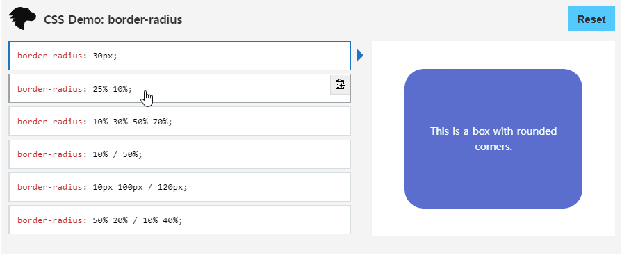
border-radius
border-radius 속성은 요소 테두리 경계의 꼭짓점을 둥글게 만듭니다.
하나의 값을 사용해 원형 꼭짓점을, 두 개의 값을 사용해 타원형 꼭짓점을 적용할 수 있습니다.
** radius = 반지름
cr: developer.mozila.org
border-radius: 10px; = 네 모서리에 다 적용 (반지름이 10px인 원형 꼭짓점)
border-radius: 10px 5%; = 상단좌측+하단우측은 10px / 상단우측+하단좌측은 5%로 설정 (마주보는 꼭짓점끼리같음)
border-radius: 2px 4px 2px; = 상단좌측 2px / 나머지(상단우측,하단좌측)4px /하단우측 2px
=> border-radius는 값(length)과 퍼센트(%)만 사용 가능함. 보통은 px이나 %단위로 (em도 쓰는듯)
https://developer.mozilla.org/ko/docs/Web/CSS/border-radius
border-radius - CSS: Cascading Style Sheets | MDN
CSS border-radius 속성은 요소 테두리 경계의 꼭짓점을 둥글게 만듭니다. 하나의 값을 사용해 원형 꼭짓점을, 두 개의 값을 사용해 타원형 꼭짓점을 적용할 수 있습니다.
developer.mozilla.org
___
.subscription h1 {
  margin-bottom: 8px;
  font-size: 24px;
  line-height: 1.6666666667;
  font-weight: 600;
  color: #212529;
}

.subscription p {
  color: #333e47;
}
__
- margin
1. 세부 속성 사용시
margin-bottom
margin-left
margin-right
margin-top
2. margin 속성 사용시
margin: 5%;                 /* 모두 5% */

margin: 10px;               /* 모두 10px */

margin: 1.6em 20px;         /* 상하: 1.6em */
                            /* 좌우: 20px  */

margin: 10px 3% -1em;       /* 상: 10px */
                            /* 좌우: 3% */
                            /* 하: -1em */

margin: 10px 3px 30px 5px;  /* 상: 10px */
                            /* 우:  3px */
                            /* 하: 30px */
                            /* 좌:  5px */
| 값 1개 | 상하좌우 (모두) |
| 값 2개 | 상하 / 좌우 |
| 값 3개 | 상 / 좌우 / 하 |
| 값 4개 | 상 / 우 / 하 / 좌 (상 기준으로 시계방향) |
** margin 속성의 값으로 올 수 있는 값
= <length>, <percentage> 또는 키워드 auto
____
❕ 이후 코드 보기
❕ 더보기
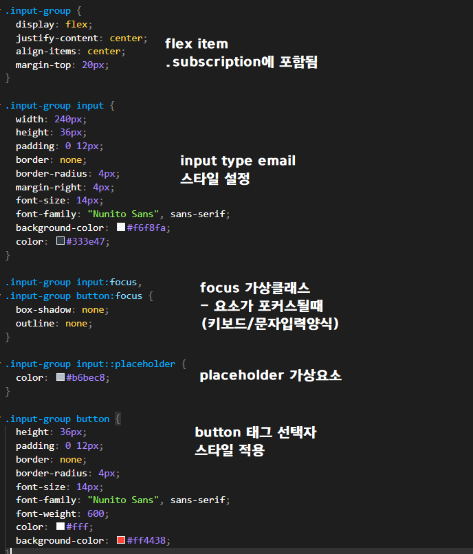
.input-group {
  display: flex;
  justify-content: center;
  align-items: center;
  margin-top: 20px;
}

.input-group input {
  width: 240px;
  height: 36px;
  padding: 0 12px;
  border: none;
  border-radius: 4px;
  margin-right: 4px;
  font-size: 14px;
  font-family: "Nunito Sans", sans-serif;
  background-color: #f6f8fa;
  color: #333e47;
}

.input-group input:focus,
.input-group button:focus {
  box-shadow: none;
  outline: none;
}

.input-group input::placeholder {
  color: #b6bec8;
}

.input-group button {
  height: 36px;
  padding: 0 12px;
  border: none;
  border-radius: 4px;
  font-size: 14px;
  font-family: "Nunito Sans", sans-serif;
  font-weight: 600;
  color: #fff;
  background-color: #ff4438;
}
가상요소
| ::placeholder | input 필드 힌트 텍스트인 placeholder |
가상클래스
| :focus | 요소가 포커스될때 (키보드 or 문자입력양식) |
REFERENCE (style.css)
https://github.com/rohjs/bugless-101/tree/master/html-practice/09-github-dropdown-menu
김버그의 HTML&CSS는 재밌다 - 구름EDU
HTML&CSS를 한번에! 탄탄한 개념이해부터 실습까지 한 강의로 끝내기, 실무 가능한 실력으로 😎
edu.goorm.io
'PRACTICE > REVERSE-ENGINEERING' 카테고리의 다른 글
| html_pr11) app.js Code Review (0) | 2021.11.08 |
|---|---|
| html_pr11) style.css Code Review (0) | 2021.11.08 |
| html_pr09) app.js Code Review (0) | 2021.11.04 |
| html_pr09) style.css Code Review (0) | 2021.11.04 |
| html_pr08) style.css Code Review (0) | 2021.11.04 |


